- language:
- JP
- EN
Works
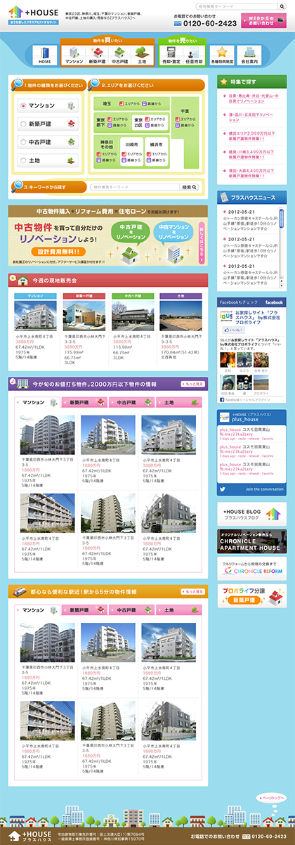
+HOUSEDesktop site
Since the core target audience is families, the design was made to have a pop and lively image. The logo was created with the theme of “helping you find your favorite property among a colorful selection.” The “+” is superimposed on the silhouette of a house to convey the image of “reliable support.”
SHARE


